
Take a minute to write an introduction that is short, sweet, and to the point.
Loisa is a New York Latin-owned DTC brand bringing puro sabor via organic seasonings, sauces, and kitchen tools that celebrate Latin culinary traditions.
Co-founded by Kenny Luna, Scott Hattis, and Chef Yadira Garcia. They’re on a mission to bring authentic Latin flavors to modern kitchens, emphasizing quality, culture, and community.
SERVICE
• Branding
• Art Direction
• Iconography
• UI/UX (Lite)
VISIT SITE
Loisa
Welcome to the New
Latin Kitchen
As Loisa grew, it recognized that its initial branding centered primarily on honoring traditional Latin flavors. However, the community's support highlighted a deeper connection to cultural representation and celebration.
The rebrand aimed to reflect a broader mission—celebrating and representing Latin culture and community in its entirety, not just through food but also through music, art, and shared experiences.
While working at Progress Labs, my role as Brand Designer was to rebrand Loisa as a community-centric DTC Latin brand that not only honored traditions but also fostered a space where Latin culture could be seen, celebrated, and grown.

Naming, Brand Identity and Positioning
Loisa embraces cultural resonance by paying homage to New York City’s Lower East Side barrio known as “Loisaida”. As well as the people from the Bronx, Brooklyn, and Queens, along with the islands and countries of their origin - Puerto Rico and the Dominican Republic.
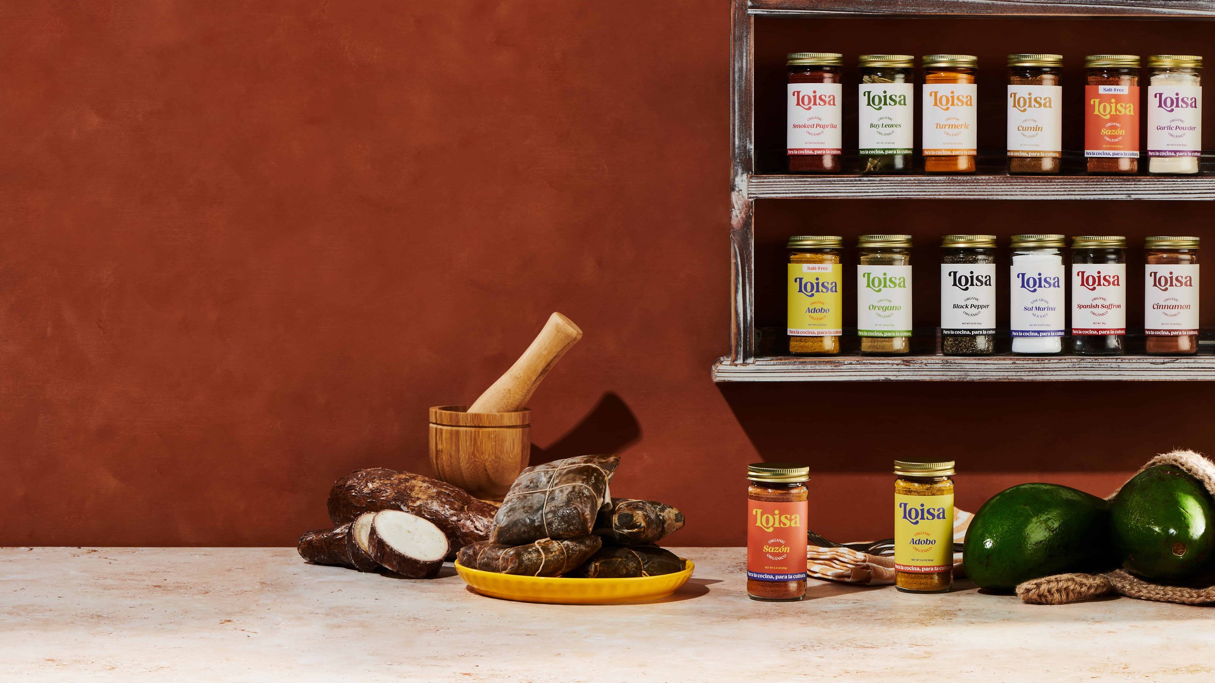
Latin heritage can be seen through product names, packaging, and storytelling. Focusing on organic, high-quality ingredients that reflect traditional Latin flavors seen in the kitchens we grew up in and the foods that nourished us like plátanos, yuca, aguacate, arroz y habichuelas.
Loisa promotes inclusivity and cultural pride, positioning itself as a brand "for la comunidad, by la comunidad." “For the community by the community”, informing the brand identity and overall tone.

Brand Typographic System

Brand Color Palette
A geometric sans-serif logomark that carries a lot of visual character. Much like the women who jump on stage, run the show, and SOUND OFF! It is intended to be bold, tall, front and center.
Brand Identity Elements
A geometric sans-serif logomark that carries a lot of visual character. Much like the women who jump on stage, run the show, and SOUND OFF! It is intended to be bold, tall, front and center.
Inspo
A geometric sans-serif logomark that carries a lot of visual character. Much like the women who jump on stage, run the show, and SOUND OFF! It is intended to be bold, tall, front and center.
Photography
A geometric sans-serif logomark that carries a lot of visual character. Much like the women who jump on stage, run the show, and SOUND OFF! It is intended to be bold, tall, front and center.
Packaging
A geometric sans-serif logomark that carries a lot of visual character. Much like the women who jump on stage, run the show, and SOUND OFF! It is intended to be bold, tall, front and center.
Social Media & Content
A geometric sans-serif logomark that carries a lot of visual character. Much like the women who jump on stage, run the show, and SOUND OFF! It is intended to be bold, tall, front and center.
Website
A geometric sans-serif logomark that carries a lot of visual character. Much like the women who jump on stage, run the show, and SOUND OFF! It is intended to be bold, tall, front and center.
Credits
Role: Brand Designer, UI/UX Designer (Lite)
Product Designer: Magda Aggurie and Courtney Wall
Design and Development: Progress Labs
Selected Works
Loisa — The New Latin Kitchen
Loisa — The New Latin Kitchen

Cardon Skincare
Cardon Skincare

Women Sound Off
Women Sound Off
