Out of Office Network– a research and design lab, helping people shift out of autopilot & live a more vibrant life. They provide programs, experiences, and tools to accompany you in cultivating a more inspiring, authentic, and energizing life.
I was commissioned to develop a new brand refresh and logo to enhance the company’s social media presence and support its efforts in pitching to investors and potential partners.
SERVICE
• Brand Identity
• Logo
• Socials
VISIT SITE
Out Of Office Network
Brand Identity + Typography
For the brand refresh of Out of Office, a platform dedicated to helping individuals cultivate a more vibrant and authentic life, I selected the Tiempos, Figtree, and Basteleur typefaces to create a cohesive and versatile typographic system.
Tiempos Collection: A modern serif family by Klim Type Foundry offers a balance of clarity and elegance, aligning with the brand's ethos of intentional living and creative exploration.
Figtree: Designed by Erik D. Kennedy, is a friendly geometric sans-serif font characterized by its clean lines and generous spacing. The slight taper and friendly curves add a touch of charm without compromising readability.
Basteleur: Crafted by Keussel, is a serif typeface that blends medieval influences with modern design elements. Its bold and whimsical characteristics make it ideal for special accents and bold headlines, adding a distinctive flair to the brand's visual identity.
Together, these typefaces provide a versatile typographic system that supports Out of Office's mission to inspire and energize its audience to break away from the daily routine and discover what makes them feel most alive.

MAIN COLORWAYS: DAY AND NIGHT, OUTSIDE WORK AND PLAY. CENTRAL FOCUS IS ON "YOU" — THE "U" IN THE LOGO IS GIVEN PERMISSION TO EXPLORE OUTSIDE THE CONFINES OF THE OFFICE 
SPECIAL LOGO: INSPIRE, CULTIVATE, ANDING WHIMSICAL FLAIR TO PLAY ACTIVATIONS
Color System + Brand Expressions
The visual identity for Out of Office Network includes a flexible 18-color palette designed to accommodate a wide range of product offerings and content formats.
This system ensures consistency while allowing for creative variation across touchpoints. One of the key brand initiatives, Creative Ways of Living, is a newsletter series on Substack and Instagram that promotes alternative approaches to work and life, encouraging individuals to break from routine, explore personal fulfillment, and embrace non-traditional paths beyond the 9–5 structure.

MONOGRAM: OUT OF OFFICE NETWORK "O" IN COLOR PALETTE


GRAPHIC ELEMENTS: INSPIRED BY THE CREATIVE PROCESS OF PEN/PENCIL TO PAPER 

GRAPHIC ELEMENTS: SERIES COVERS WITH GUEST ARTIST ILLUSTRATIONS Social Media + Newsletter Design
To support the client's evolving content strategy, I developed a set of flexible Instagram templates for both posts and stories. These templates were designed with multiple layout variations and colorway options to maintain visual consistency while accommodating a range of content types.
Additionally, I created branded Substack templates to streamline newsletter publishing and ensure alignment with the overall identity across digital platforms.

SUBSTACK: ICON AND NEWSLETTER HEADER 


INSTAGRAM STORIES: TEMPLATES FOR MULTIPLE CONTENT NEEDS INSTAGRAM — VARIOUS PRODUCTS WITH BRAND RE-FRESH: BOOKLET, WEBSITE, PAID VIDEO CAMPAIGNSExtending the Brand Experience Through Uniform Design
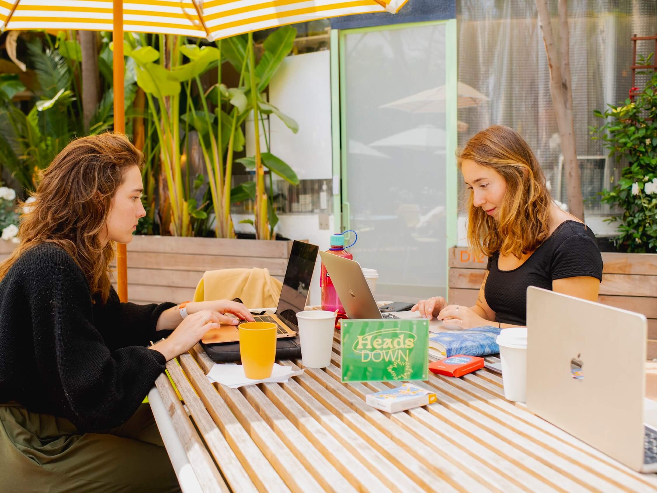
One of the client’s key concerns was the growing sense of disconnection and lack of spontaneity brought on by remote and hybrid work. To address this, they developed Field Trips—in-person gatherings designed to reintroduce creativity, novelty, and human connection into daily routines. These experiences are intended to function as modern rituals, encouraging participants to be more intentional with their time and interactions.
To support this initiative, I was tasked with designing a physical brand expression in the form of a uniform.
The goal was to create wearable pieces that would spark conversation in public spaces, like a friendly invitation to connect over coffee. This uniform not only reflected the visual identity of the brand but also served as a tool for building community in real life, reinforcing the company’s mission to make remote work feel less isolating.

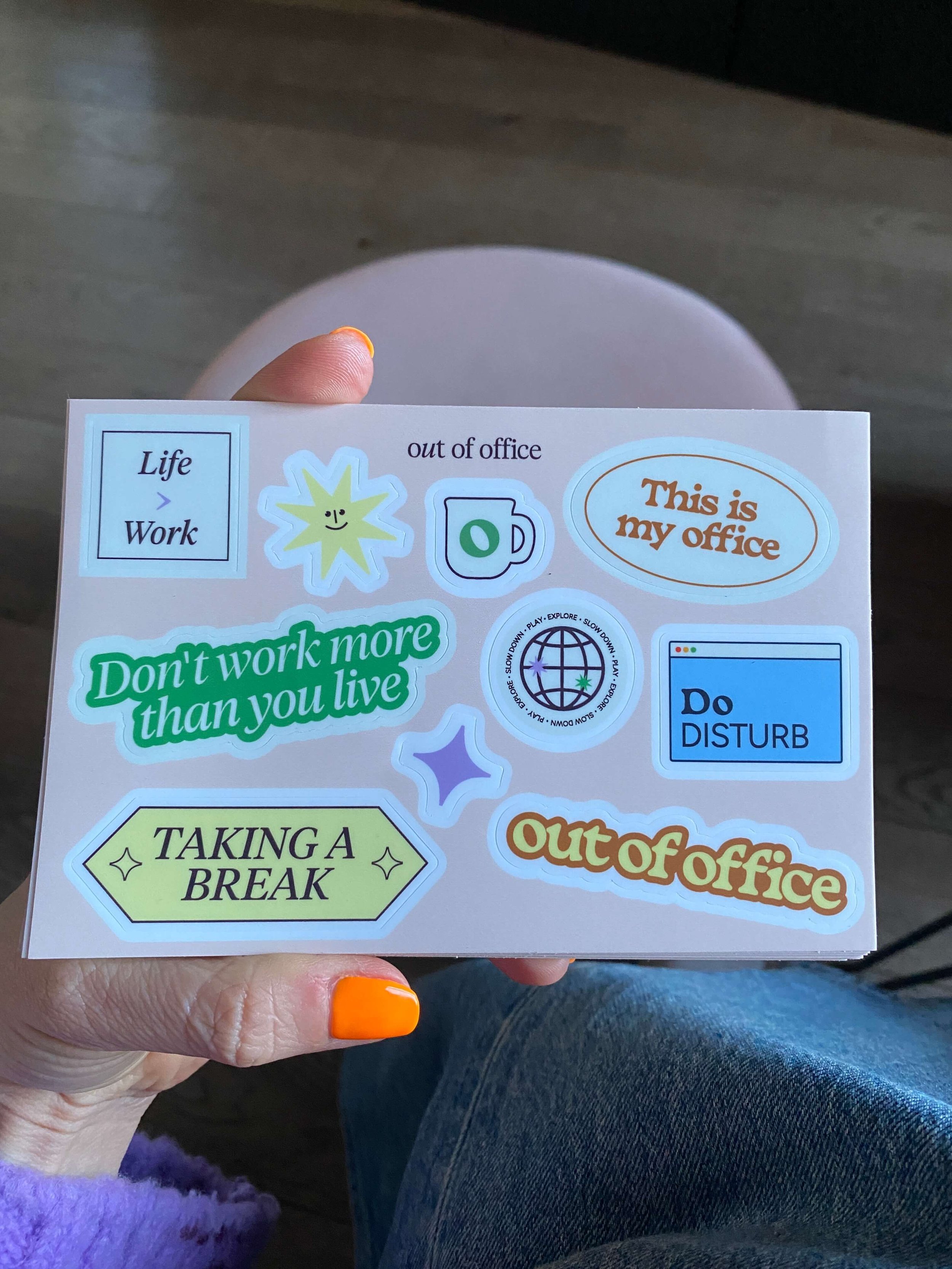
STICKERS — CONVERSATION STARTERS: APPLIED ON LAPTOPS, WATER BOTTLES AND NOTEBOOKS 
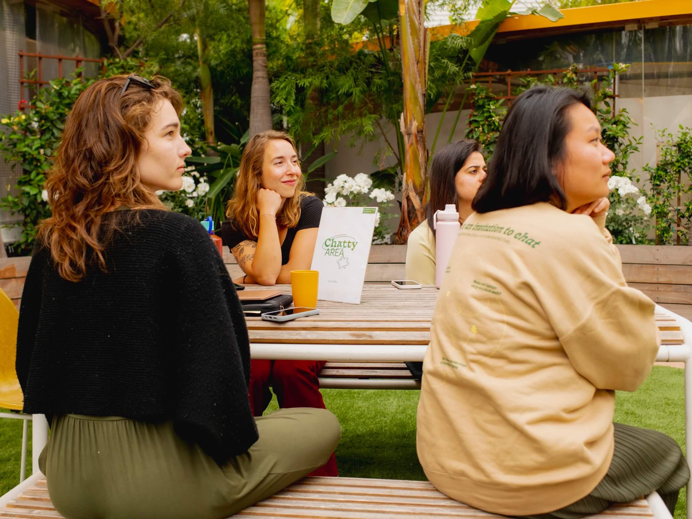


IRL MEET UPS — UNIFORM WORK WEAR LAUNCH AND OOO IN THE WILD OUTSIDE OF THE INTERNETCredits
Role: Designer
Creative Direction: Terry Tucker
Photographer: Jason LeCras
Client: Alice Katter — Out of Office Network
Loisa — The New Latin Kitchen —
Loisa — The New Latin Kitchen —
Selected Work

Cardon — Skincare —
Cardon — Skincare —

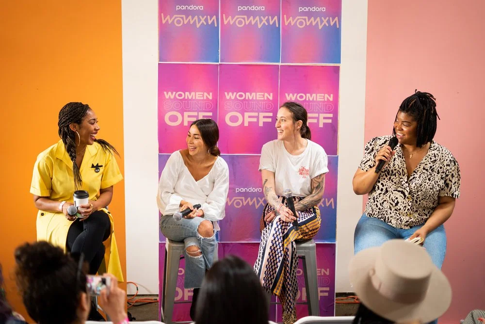
Women Sound Off — Festival —
Women Sound Off — Festival —