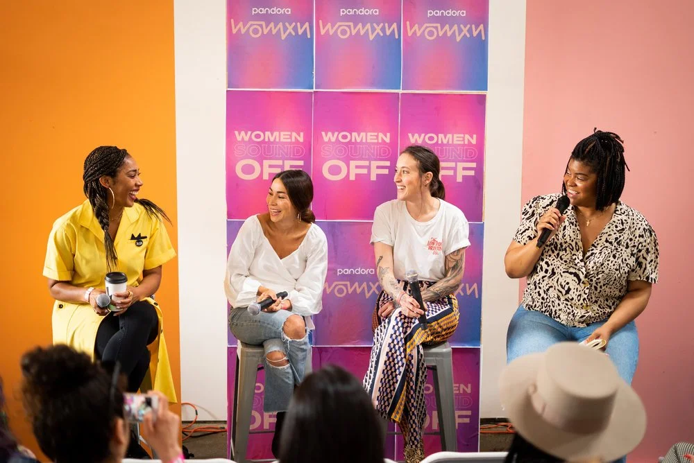
Women Sound Off Festival – an annual music festival and conference in Oakland, CA. The festival empowers Black/WOC creatives by creating a safe space to network, celebrate, and flourish within the music, media, art, and tech sectors.
The design system represents women's diversity through playful, contemporary, shapes and bold colors coming together in this festival.
Due to the COVID-19 pandemic, Women Sound Off Festival was cancelled.
Below are proposed ideas of how Women Sound Off Festival 2020’s playful design system would be translated as signage and event designs for the in-person conference venue.
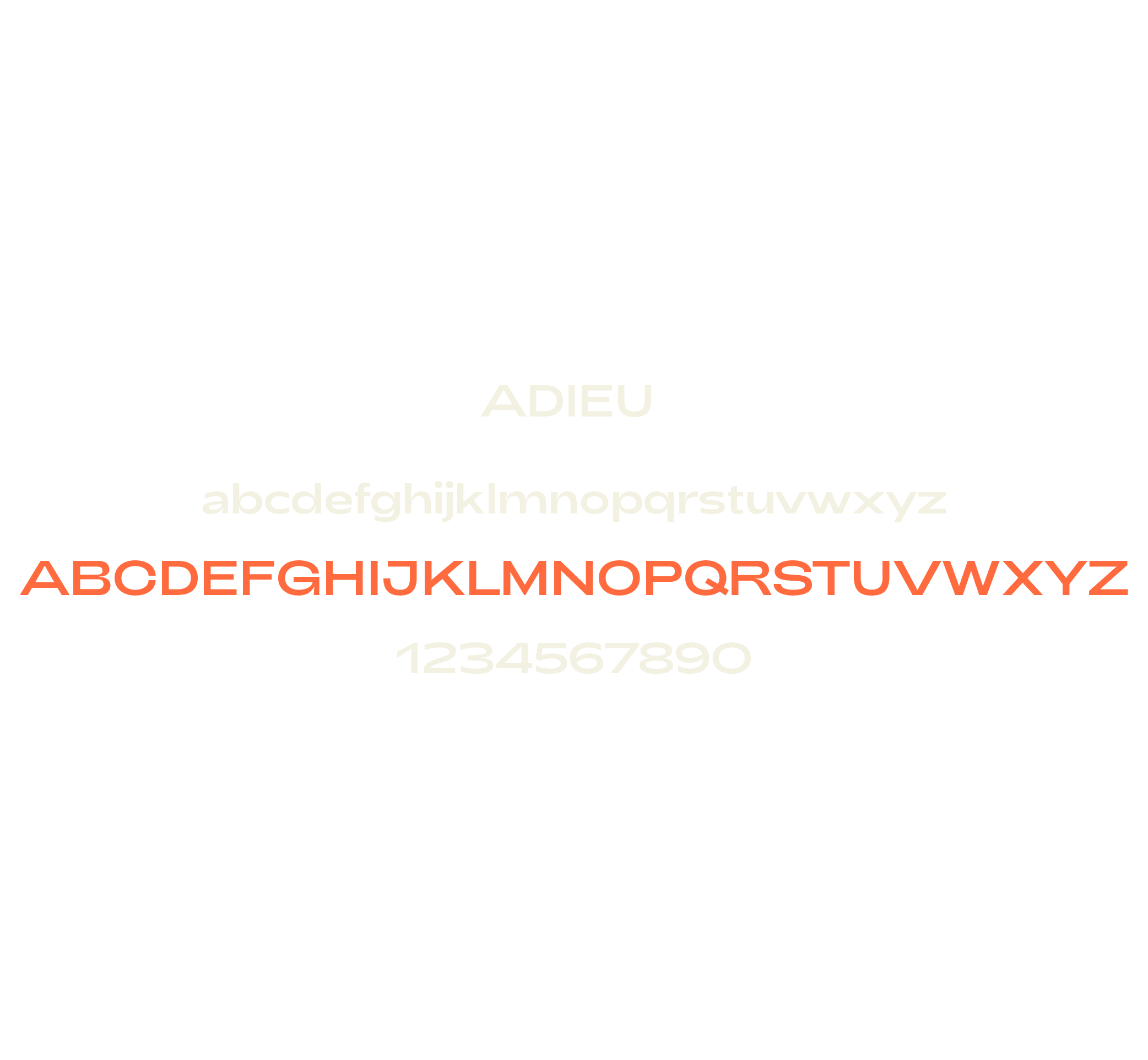
Logo + Typography
A geometric sans-serif logomark that carries a lot of visual character. Much like the women who jump on stage, run the show, and SOUND OFF! It is intended to be bold, tall, front and center.


Color + Shape
A geometric fluidity in what it means to be a woman or non-binary creative.
The color palette derives from the unexpected voices — the energetic, loud, bold, quiet, and playful — the all you can be of any shape and size.
Festival Promotion & Animation
To represent the diversity of Women Sound Off’s audience, I created a design system that encapsulates the brand's essence through authentic, playful, minimal shapes, and bold colors coming together in this festival.
With the assistance of a designer, we created marketing assets shown through social media, in the form of digital flyers, influencer graphics, and video ads.
Video promotions were brought to life with playful energy, sharp movements, and graphic compositions.

sound on

sound on


Bridge Yard — Venue
Before the festival was canceled, we had suggested using vinyl decals featuring our brand elements across the venue. Additionally, we planned to bring inflatable structures to life based on these shapes, creating installations that would serve as play activations during the in-person conference.


Credits
Role: Lead Designer, Art Director
Designer: Donna Micaella
Videographer: Belinda Man
Client: Women Sound Off
Loisa — The New Latin Kitchen —
Loisa — The New Latin Kitchen —
Selected Work

Cardon — Skincare —
Cardon — Skincare —

The Healing Cloud —
The Healing Cloud —
